Brand identity
Solara Studio is a fictional wellness brand exploring how circadian rhythm, neuroscience, and sensory design can shape the emotional experience of a space.
This brand identity system reflects the studio’s core mission: using light, color, and architectural calm to help the body downshift into rest.
Disciplines
Brand Identity, Art Direction, Illustration, Creative Strategy
Mock Client
Solara Studio
Year
2026
Design challenge and solution
The Challenge
Design a visual identity that communicates emotional regulation and scientific clarity without leaning on literal wellness clichés. The brand needed to feel calm, intelligent, and grounded in desert minimalism.
The Solution
A system built around circadian rhythm, warm-to-cool gradients, and quiet editorial typography. The final identity merges scientific diagrams with sculptural desert forms, creating a brand that feels both research-led and sensorially soothing.
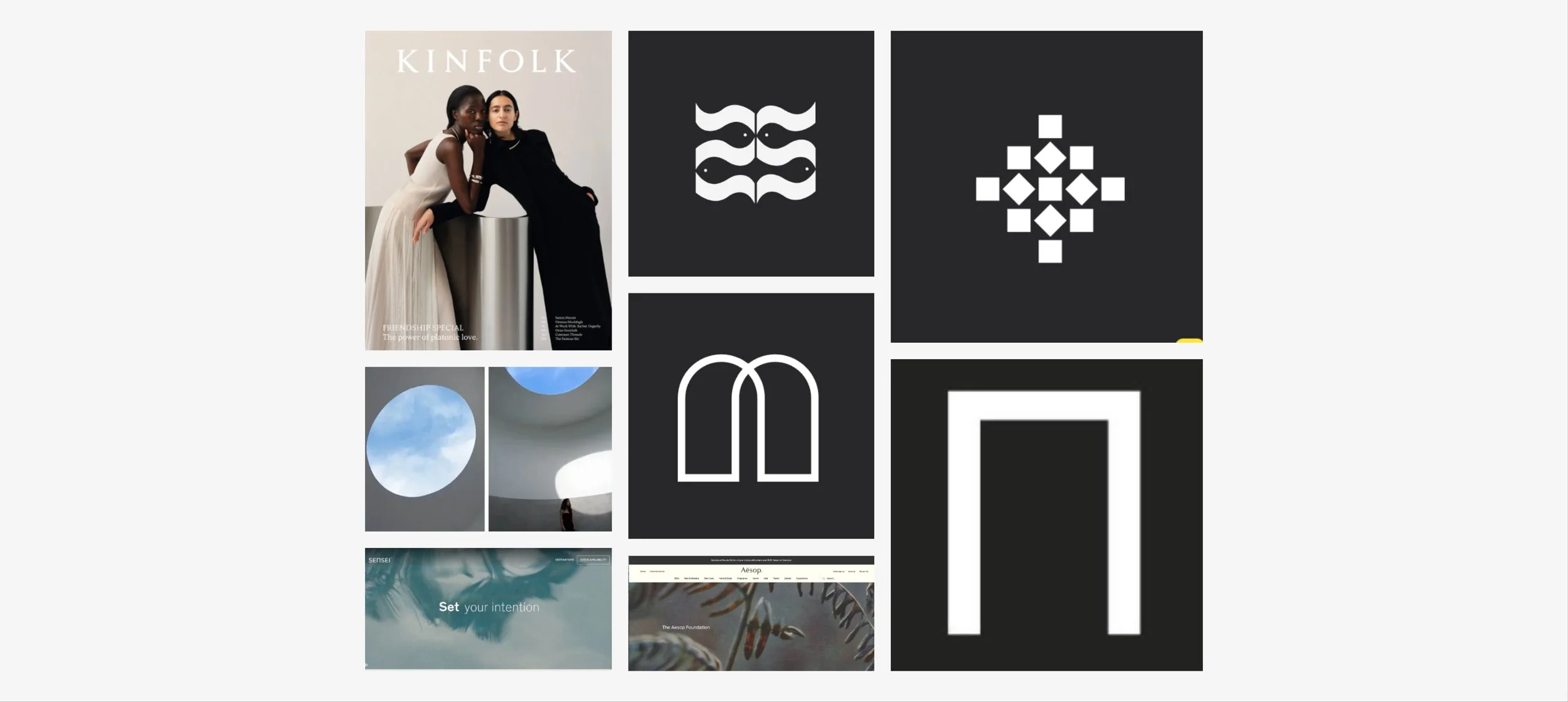
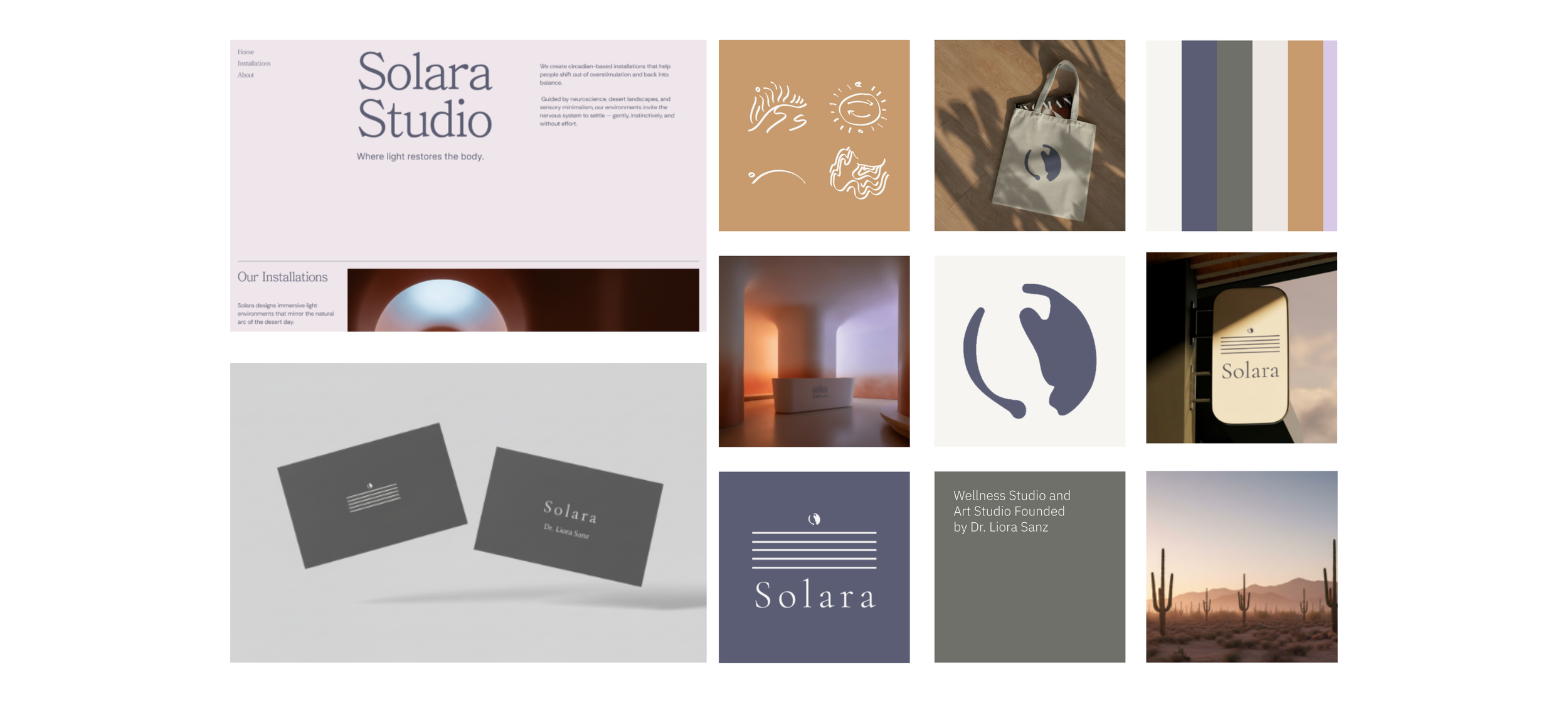
01 Moodboard
The moodboard establishes the emotional tone of Solara: a softness, curved architecture, scientific-poetic linework, and spacious editorial imagery.
Each reference supports the brand’s foundation in circadian light, neuroscience, and desert stillness.
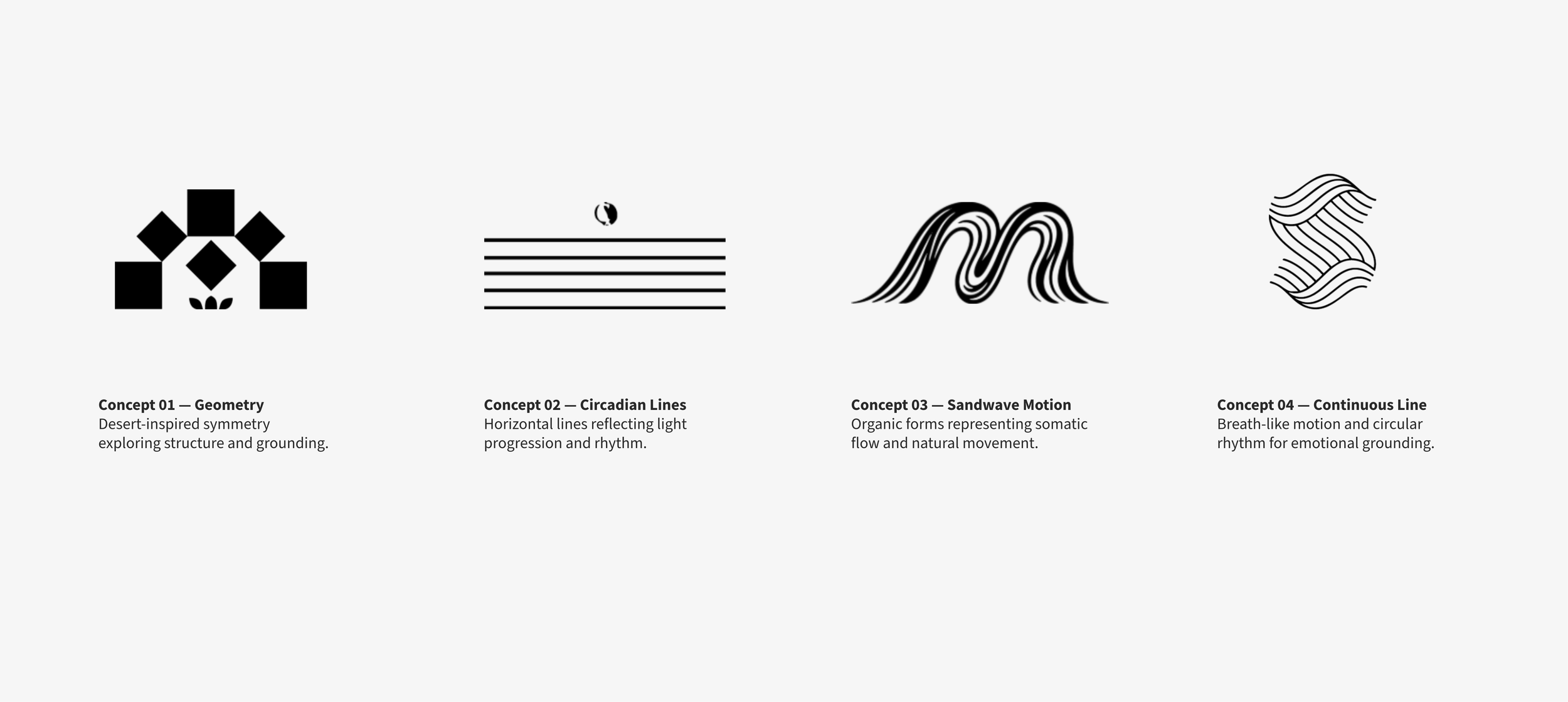
02 Logo exploration
The exploration process centered on a single question: How can a mark express rhythm, intelligence, and emotional stillness?
The circadian line symbol and the circular arc emerged as the clearest visual representation of Solara’s mission: a studio where light becomes a tool for restoration.
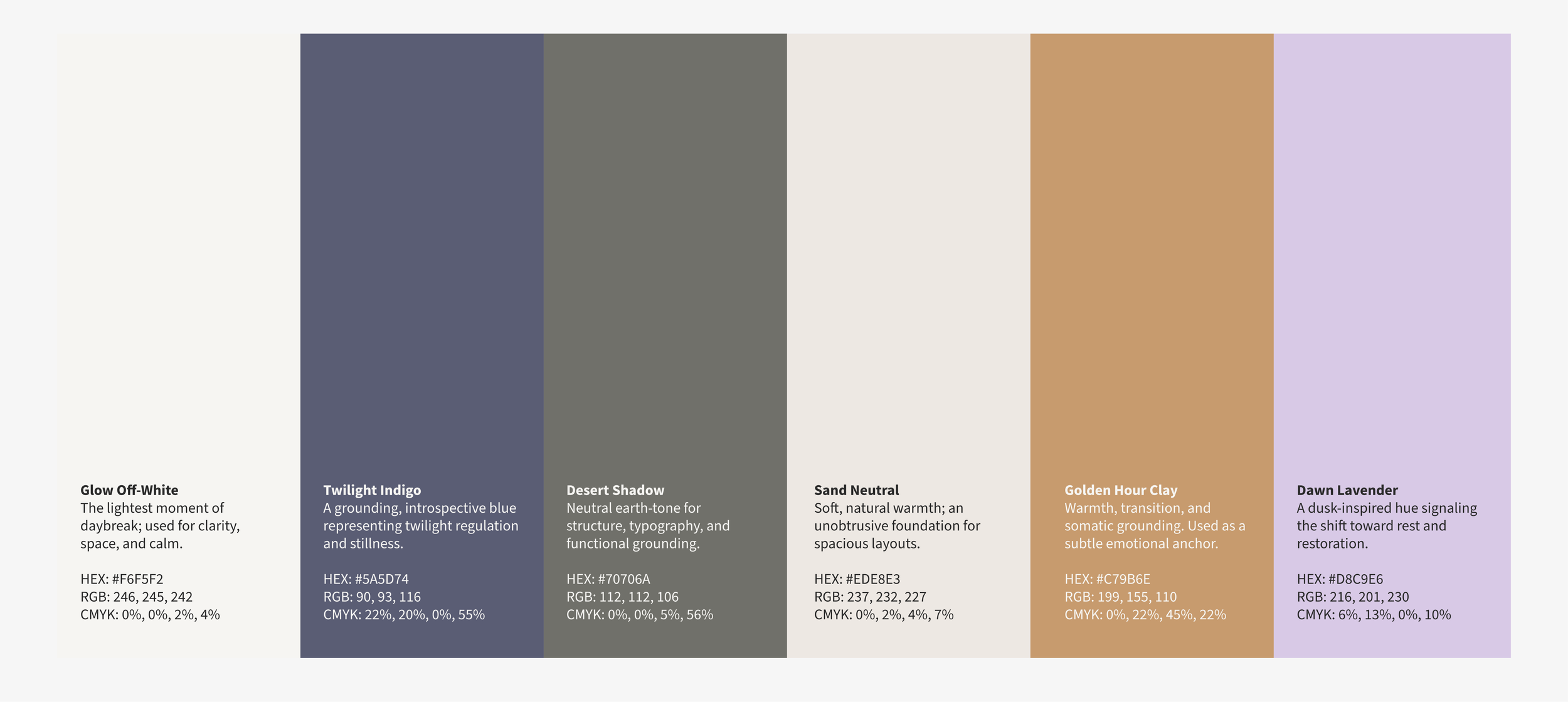
03 Color palette
Solara’s palette is derived from the desert’s quietest transitions — warm clay, soft neutrals, atmospheric blue, and lavender dusk.
Each tone supports emotional regulation and reflects the circadian-inspired approach behind the identity.
04 Brand application
The identity system was applied across conceptual brand touchpoints to show how Solara could exist in real environments. Applications include signage, business cards, merchandise, installation renderings, and a digital presence. Across all pieces, the system maintains its core attributes: clean typography, gentle gradients, rhythmic linework, and a calm desert sensibility.
05 Reflection
This project explores how brand systems can support emotional experience. Solara reaffirmed the value of restraint, intentional pacing, and designing with the nervous system in mind. The result is a brand that feels quiet, steady, and aligned — much like the installations it represents.