Brand identity
LINECUT is a contemporary editorial platform focused on cultural criticism, creative research, and emerging discourse across design, media, and technology. The brand needed to feel sharp and confident without becoming loud—capable of holding complex ideas while remaining visually restrained.
The identity system was designed to balance rigor and flexibility, allowing the brand to scale across editorial content, digital platforms, and cultural touchpoints without losing clarity or cohesion.
Disciplines
Brand Identity, Art Direction, Editorial Strategy, AI
Mock Client
LINECUT*
Year
2026
Design challenge and solution
The Challenge
The challenge was to create a visual identity that could support long-form editorial content while remaining distinctive and adaptable. The system needed to accommodate dense text, evolving themes, and a wide range of content formats without overwhelming the reader.
The Solution
The solution was a modular identity rooted in typography, spacing, and restraint. Rather than relying on decorative elements, the system emphasizes hierarchy, rhythm, and consistency—allowing content to lead while the brand provides structure and tone.
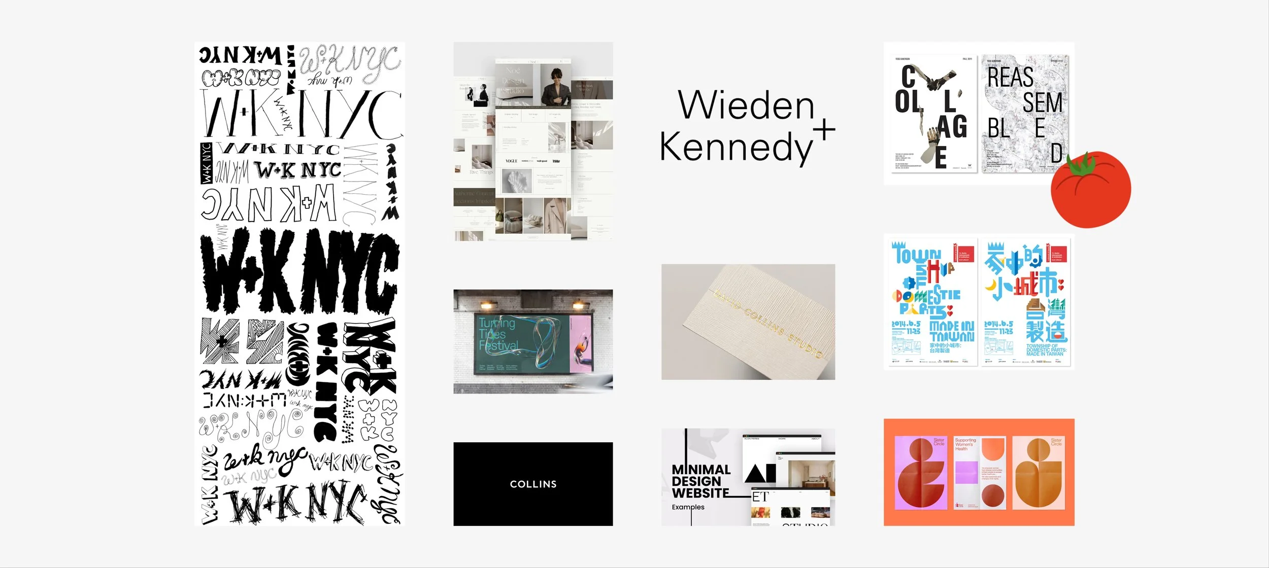
01 Moodboard
The visual direction draws from modern editorial publishing, archival typography, and cultural institutions that prioritize clarity over spectacle. References span contemporary media platforms and legacy print systems, unified by a shared commitment to legibility, contrast, and compositional balance
The moodboard established a foundation for tone: confident, direct, and editorial, with room for nuance.
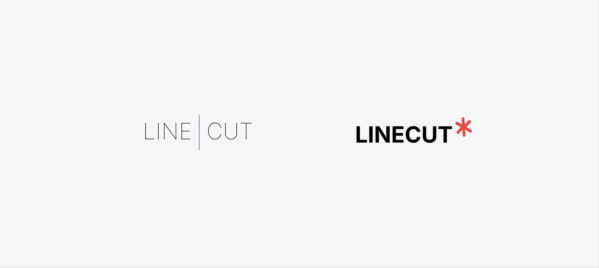
02 Logo exploration
Logo exploration focused on simplicity and recognizability. The wordmark anchors the system, supported by a minimal symbol used sparingly as a graphic accent rather than a dominant mark.
The final direction reflects the brand’s editorial voice—precise, intentional, and unembellished—while remaining flexible across contexts.
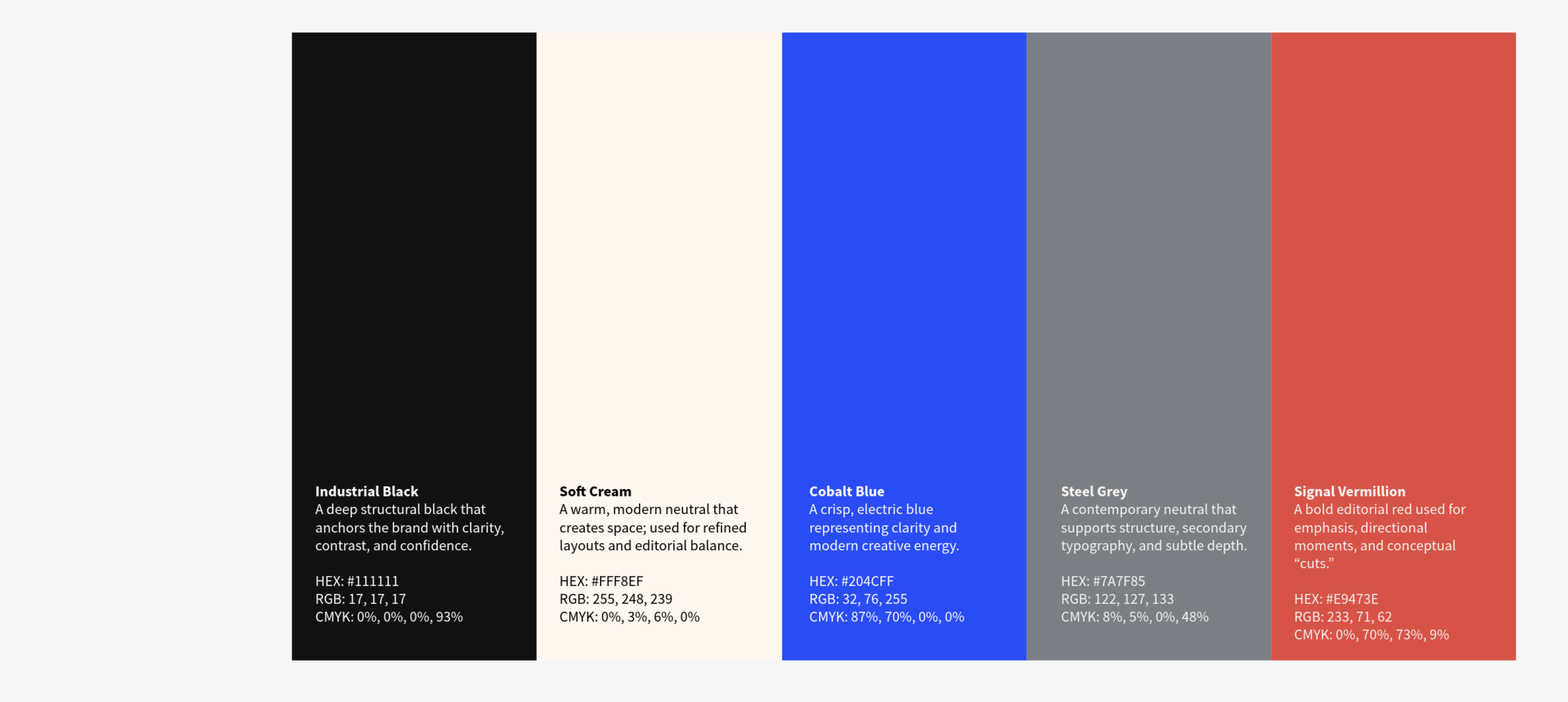
03 Color palette
The color palette was designed to support readability and contrast across editorial layouts. Neutral foundations are paired with bold accents to guide attention without overwhelming content.
Color functions as a structural tool rather than a decorative one, reinforcing hierarchy and aiding navigation across formats.
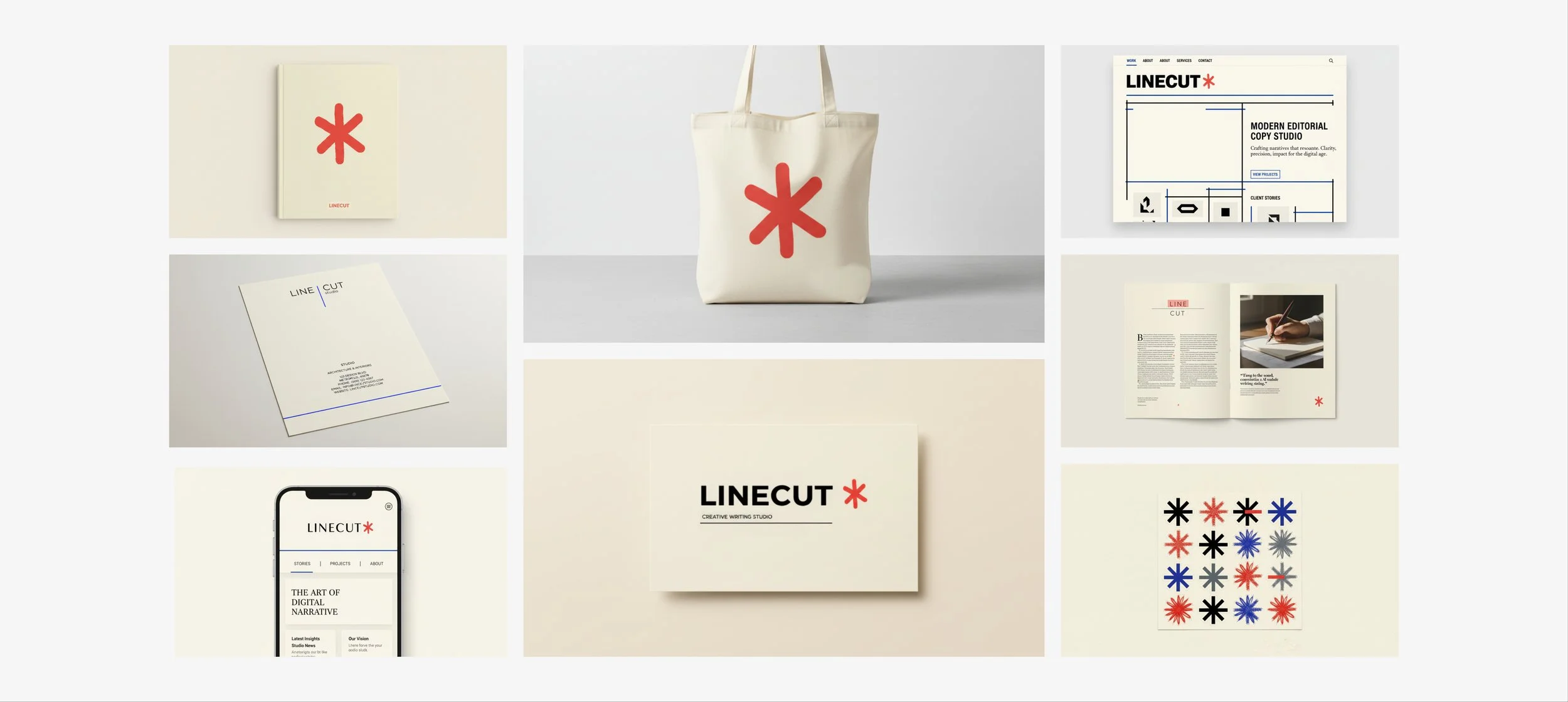
04 Brand application
The identity system was applied across print and digital touchpoints, including editorial layouts, promotional materials, and interface components. Each application demonstrates how the system adapts while maintaining consistency.
Typography, spacing, and hierarchy remain the primary drivers of visual interest, ensuring the brand feels cohesive regardless of medium.
05 Reflection
This project reinforced the importance of designing systems that prioritize content, clarity, and longevity. LINECUT’s identity is intentionally quiet—built to support ideas rather than compete with them.
The work reflects my approach to brand design as infrastructure: thoughtful, flexible, and grounded in real-world use.


